Our Journey to a new logo
Nowadays it is becoming more and more important to advertise projects with a professional appearance on the Internet. In addition to the creation of relevant content for the website and social media channels, it is above all important to create a uniform and appealing design for the representation of the project using colors, fonts and, above all, a logo. This shows professionalism and promotes recognition.
In the case of fonts, you can fall back on a huge pool of license-free fonts on the Internet – and colors cannot be protected anyway. When it comes to logos, however, there are some pitfalls that need to be considered: In an early project phase, it can be tempting to cobble together an initial logo with the help of the extensive pool of stock media. Various license types can be found on the known platforms, which also regulate the usage rights for the stock media.
The issue with logos from stock media
If you now take the trouble to read the fine print of the license agreement carefully, commercial use of stock media is apparently allowed. However, if you read on you will quickly find that there are often further paragraphs in the license agreements that explicitly exclude the use of stock media as a logo or part of a logo, especially in the commercial sector. Interestingly, the exclusion of this type of use usually remains widely unaffected by the chosen license type.
In times in which copyright and license violations on the Internet may be detected fully automated with the help of artificial intelligence, the use of stock media in logos could become a serious problem. To what extent the resulting risks are acceptable, everyone then has to weigh for themselves.
After we became aware of these nasty paragraphs in the license agreements for stockmedia, it quickly became clear to us that our previous almond logo (from the stock media library of a popular graphics platform) had to give way to a symbol with the right to exclusive use. This wish is easier said than done and your own attempts at drawing quickly disappeared in the quicksand of frustration…
What should the new logo be like?
It so happened that me and my love took a little break in Nicaragua at the beginning of 2020. On the heavenly twin volcanic island of Ometepe, we visited a wonderful little eco-project, which was launched by Israelis and is dedicated to the organic cultivation of cocoa and the preparation of vegan food. The project is named El Pital and should be on every itinerary on Ometepe just and not only because of the stunning cocoa drinks.

After some delicious cocoa shakes in El Pital, we noticed their beautiful logo on their business card: A cocoa fruit in the style of a roughly dotted, traditional tattoo (dot work).
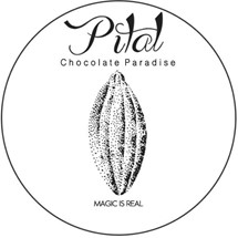
We then found out that the El Pital logo was designed by a friend of the project, a French-born tattoo artist living in Guatemala. From that moment it was clear to us that a similar style would also go very well with the almond design of the Mas Baillette logo. Unfortunately we didn’t manage to get in touch with the designer of the cocoa fuit logo of the El Pital.
First attempts but no results
After some deliberation and fruitless tapping into our own circle of friends in Germany and New Zealand, we came up with the idea of posting a tender on a renown platform for freelance graphic designers. There was a flood of offers and we decided to work with designers from Pakistan and the Philippines. Each of the contractors promised to offer us a logo exactly according to our wishes with an unlimited number of corrections at a fixed price. Unfortunately, nothing more came out of all attempts than head-shaking laughs on our part and we ended our collaboration after many correction loops and paid our bill. The beautiful saying “Pay peanuts get monkeys” had once again come true.
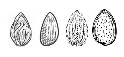
New logo in sight!
Our journey through Nicaragua continued and along our route we also reached the coffee-growing region of Nicaragua, the area around Matagalpa. There we spent a few days in the highlands on a wonderfully located small farm where coffee was produced in the finest organic quality. The owner of Finca Musica del Bosque is an Englishman who does not live on site due to other obligations. A Nicaraguan family lovingly takes care of agriculture and guests so that coffee production still works. Organizationally, Finca Musica del Bosque is supported by the Dutch owner of La Buena Onda from Matagalpa, who acts as the local manager. Once there and settled in, we quickly got into conversation with the Canadian volunteer Samaria. Samaria had started to decorate the veranda and the walls of Finca Musica del Bosque hands-free with breathtaking works of art. It quickly turned out that Samaria’s life revolved around art and that she had the dream of one day becoming a tattoo artist. We then told Samaira about our project, the Mas Baillette. We showed her the beautiful logo of El Pital as well as our then current almond from the logo and asked her if she would have the time and inclination to support us in creating a new logo. Believe it or not – she said yes! And although our “new” almond has been dwelling on my hard drive for over a year, I would now like to proudly present the new logo of the Mas Baillette.
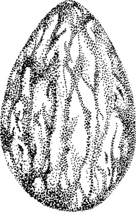
Add some text and color and you will get the following look for our various online channels (and hopefully soon business cards).
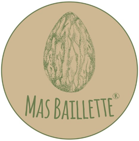
Dear Samaria, of course a thousand thanks go to you for all the work you have put into the design and revision of our new almond. We feel very glad to have met you!
